
The Problem With Classical Forms and Why Data Entry Eats Your Day
When software makes you build the structure AND enter the data, one PDF page becomes fifty forms. A better way to think about the tools you rely on.
Most DMC software makes you build the structure and enter the data at the same time, turning one contract page into dozens of forms. Here is why that happens, what it costs you, and a simpler, easier-to-verify way to think about it.
A new contract arrives from a resort. It is a tidy PDF and a rate table you can read in thirty seconds. Then you open your pricing software to enter it, and the thirty seconds becomes an afternoon. One page turns into form after form after form.
If that sounds familiar, the problem is not you, and it is not the resort. It is the shape of the software. Most DMC pricing tools were built around how a database stores data, not around how you actually work. That single design choice is why contract data entry eats your day and why one wrong number can quietly cost you a sale. This is a story about form design, user experience, and the money that leaks out when the two go wrong.
The screens follow the database, not the work
Here is the thing no one tells you. Most existing price-calculation systems were built as a mirror of how the data is stored in the back end. Engineers took the database tables and turned each one into an on-screen form. Clean and logical for the database.
But you do not think in database tables. You think in rate sheets. So the screens follow the storage, not the job, and you are left to bridge the gap by hand.
To price a single resort, a classic system often makes you do this, one save at a time:
- First, create the resort.
- Then create an agreement (the contract) under it.
- Then add each season, e.g for high, low, shoulder.
- Then add each room type , e.g beach villa, over-water suite, garden room.
- Then, for every season and every room type, enter the rate.
In the contract, that is one small table you could photograph. On screen, it is many separate forms, saved one by one. And notice what is really happening: you are not just entering the data. You are also building the structure that holds it.
You are the data-entry operator AND the architect
That is the trap. The software hands you two jobs at once and pretends they are one.
You are the data-entry operator, typing rates. And you are the architect, constructing the skeleton of resorts, agreements, seasons, and room types before a single rate has a place to live. Two roles, one person, one afternoon gone.
This is why it does not scale. One page of a PDF can explode into tens of forms. Ten resorts refreshing their contracts each season is not ten pages of work, it is hundreds of little forms, each with its own save button and its own chance to go wrong. The math is brutal, and it gets worse every renewal season.
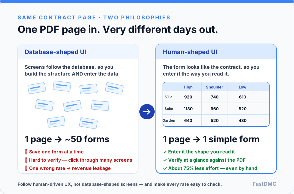 The same contract page, two philosophies: build-the-structure-yourself versus enter-it-the-way-you-read-it.
A simpler shape: forms that look like the page
The fix is not more training or faster typing. It is better form design when forms that capture information in a shape close to the PDF itself.
If the contract shows a grid of seasons across the top and room types down the side, the entry screen should look like that grid. You fill it in the way you read it, instead of hopping between five nested forms to place one number. When the tool matches the source, the structure mostly builds itself in the background.
Done well, this simple change can save around 75% of the effort, even when you are still entering everything by hand, before any automation enters the picture. It is not magic. It is just removing the invisible second job. This mirrors what usability research has said for years: shorter, well-grouped forms that follow a person's mental model beat sprawling, fragmented ones. Nielsen Norman Group's top form-usability guidelines and a controlled study comparing single-page and multipage forms both point the same way: fewer screens, fewer errors, faster completion.
The real prize is verification
Speed is nice. But the most important benefit of a human-shaped form is something quieter: verification.
When your entry screen looks like the contract, checking your work is easy. You put the PDF next to the screen and your eye runs across both. A wrong number jumps out in seconds.
Now picture the database-shaped version. To verify one resort, you click through the resort form, then the agreement form, then each season, then each room type, then each rate having many screens for one simple table. Nobody has time for that, so most people skip it. And skipped checks are where money hides.
Because here is what a single wrong rate does. Price calculation is only as good as its inputs, so one mistyped number changes the quote:
- Enter a rate too low, and you undercharge. That is direct revenue leakage where a real margin gone on every booking until someone notices.
- Enter a rate too high, and you overprice the stay and lose the sale to a competitor who did not fumble a digit.
Either way, one keystroke moves money. This is the well-known 1-10-100 rule of data quality: it costs a little to catch an error at entry, ten times more to fix it later, and a hundred times more when it slips through to the customer. And manual entry is not rare-error territory where studies put the manual data-entry error rate at roughly 1 to 4% of fields. Across hundreds of rates, that guarantees mistakes. A form you can actually verify is your cheapest insurance against them.
Why this matters more in your world
Contracts change constantly. A resort bumps its peak rate, adds a green tax, or shifts a season by a week and every format is different. No two rate sheets look alike.
That churn is exactly why a verifiable, human-shaped form matters so much for pricing accuracy. When the next version lands, you want to check it in a minute against the PDF, not re-navigate a maze of screens hoping you did not miss a field.
The lesson for the tools you rely on
If you take one idea to your software vendor, make it this: follow human-driven UI and UX, not data-driven, database-shaped screens.
The database can stay as complicated as it needs to be underneath. That is the software's problem to hide, not yours to assemble. Good tools shape themselves around how people actually work. Its the core idea behind human-centered design. The screen should meet you where the contract already is.
This is exactly the principle we built FastDMC around. Entry screens are shaped like the contracts you already read, so you enter rates the way they appear and verify them at a glance against the source. Less structure-building, less clicking, far less risk of a quiet, costly typo. The database still does its careful work in the background and you just never have to hand-build it.
The takeaway
Classical forms feel slow because they quietly hand you a second job: building the structure while you enter the data. That does not scale, and it makes verification so painful that people skip it. Which is precisely where revenue leaks. Ask your tools to look like your contracts, not like a database. Simpler forms save most of the effort, and the ability to check your work in seconds protects the margin on every quote you send.
Further reading
- Website Forms Usability: Top 10 Recommendations — Nielsen Norman Group
- A usability study comparing single-page, multipage, and conversational forms
- Manual data-entry error rates: how many typos are hiding in your systems? — DigiParser
- The 1-10-100 rule of data quality — Matillion
- Human-centered design — Wikipedia